Fun fact: the first web page to ever exist was created in 1991! It was meant to provide information about the World Wide Web (which was only a project at the time) and had a particularly unfriendly URL: http://info.cern.ch/hypertext/WWW/TheProject.html. Try reading that out loud to someone today and watch them react.
It feels like we’ve come a long way since then. I mean, it’s been 30 years. Yet many brands are still making the same mistakes when building their websites. This goes without saying, but I’ll say it anyway. Whether you’re a startup, a one-man show, or a small business, having a website is no longer optional.
As I recently told a client with a solid Instagram presence and massive following, your website is the one piece of digital real estate that you actually own. Everything else, your social media profile, networking page, review platform, and business listing is rented property. One day, your landlord may decide that they need the unit for their mother-in-law’s second cousin to live in. Or their rules have changed and they no longer allow pets. Where are you and Fido supposed to go now? Your website, that’s where.
Designing Your Website
This isn’t a branding tutorial. As such, we won’t get into the nitty gritty of choosing your colours or fonts. The one thing I’ll highlight, however, is that it’s important to have a strategy and an overarching plan to design an effective website. This will allow you to maintain a consistent brand image across all your digital, and even physical, platforms. It will also ensure a visually pleasing and seamless experience for your audience.
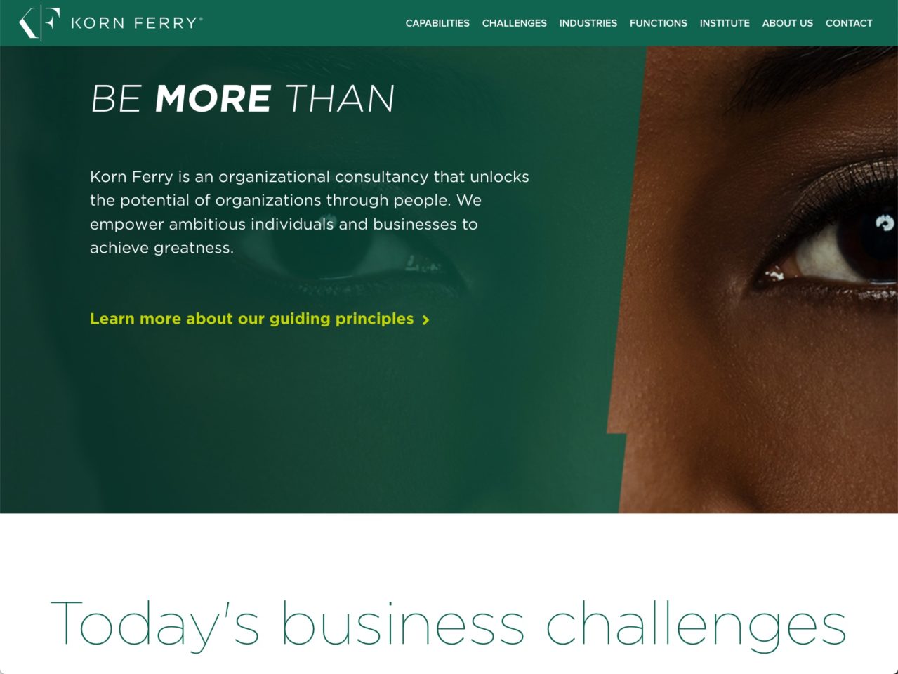
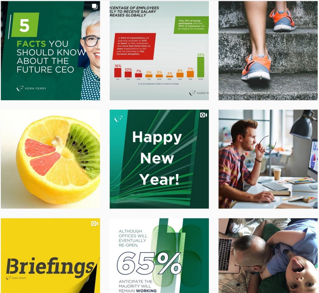
For example, here’s how a brand like Looka keeps its aesthetic cohesive across its platforms.


Even if your brand leans towards the traditional or your audience prefers a more formal image, you can still achieve this level of cohesion – with the right strategic plan.
If you’re not sure which website builder to use for your site, check out this breakdown of the top 5 website builders for DIYers.
Now every couple of years, it seems like there’s a new web design trend out there that every new site decides to follow. A few years back, that was parallax. Before that, we had the “one-page” scrolling website that was actually seventyleven pages stacked in a seemingly bottomless scroll.

There’s nothing wrong with following trends as long as you remember one rule of thumb. The one thing your website should do is provide an easy, enjoyable experience for your audience. Imagine going into a store that has an enticing display window. You walk in. Right away, instead of seeing their products clearly displayed and organized on the sales floor, there are four or five different doors – each one leading to more doors and hallways that lead… well, who knows where. There are posters everywhere about how their grandfather started this business, how it evolved, their different locations. What isn’t there is an easy way to view or buy or even learn more about how their products can solve your problems. Frustrating, right? Don’t do that to your site users.
Tips to build (or improve) a website yourself
5. You really only need three to five tabs to organize your content.
Unless you’re a large organization with several products and services, you don’t need a 20-page website. In fact, many of those larger entities are finding ways to clean up their menu and navigation to prioritize simplicity, usability, and speed. And if you really must have that many pages, use a hamburger menu and dropdown tabs like this to keep it organized.
4. Focus on what your audience wants to know.
Did you know that the “About” page is the most high ranking website page after the “Home” page? People want to know who they’re in business with, so make sure to include the right information about who you are as a person or business. You’ll also want to include pricing information somewhere on your site. Even if you’re in the business of services, providing a baseline or broad packages can help put your audience at ease about affordability. Next, spend some time on your FAQ page. This is extremely important, especially if the information can help alleviate any fears or hesitation around your product or service.
3. Be mindful of your website speed.
This one’s pretty self-explanatory. Make sure that your site isn’t bogged down by extremely large media files, an infinite array of plugins, or complex scripts in the backend. It’s 2021 – therefore there’s no question that your website should be mobile-responsive. So be sure to check the speed on mobile too!
2. Enable instant gratification wherever possible.
We all crave gratification, and website browsing is no different. Consider setting up online scheduling for people to book an appointment with you directly from your site. Automate your system to confirm appointments instantly too, if possible.
And don’t discount the power of a personable, human element in the web experience either! This is where a video, email, or call from a real human can warmly move your site visitor through their buying journey.
1. Include the best way(s) to get in touch with you.
At the end of the day, your website is primarily a tool for people to get to you. “You” in this case will depend on whether you’re marketing a product, a service, a business, or yourself as a person. So make it easy for people to get in touch. Whether it’s to share questions, kudos, complaints, or just to be involved, people will want relevant contact information on your website.
The Takeaway
You don’t need to be a web developer-slash-marketer-slash-brand strategist to build a website. With the right tools, you can do it yourself! And unlike the printed brochures from the past, a website isn’t a one-and-done project that lives on forever. It’s a dynamic thing that you can change and improve over time.
What are the biggest struggles you’ve faced trying to build your own website? How did you get around them? Let me know in the comments!
Pingback: Best Website Builders for Equipment Rental Businesses
This is very informative. I’m a budding entrepreneur, having recently started a chili and flavored butter side hustle (soon to be a full fledged business). One of my relatives told me the exact same thing about creating my own website because one never knows when Instagram or Twitter will shut down one’s account and my business will suffer. Thank you for the tips.